
Above the fold
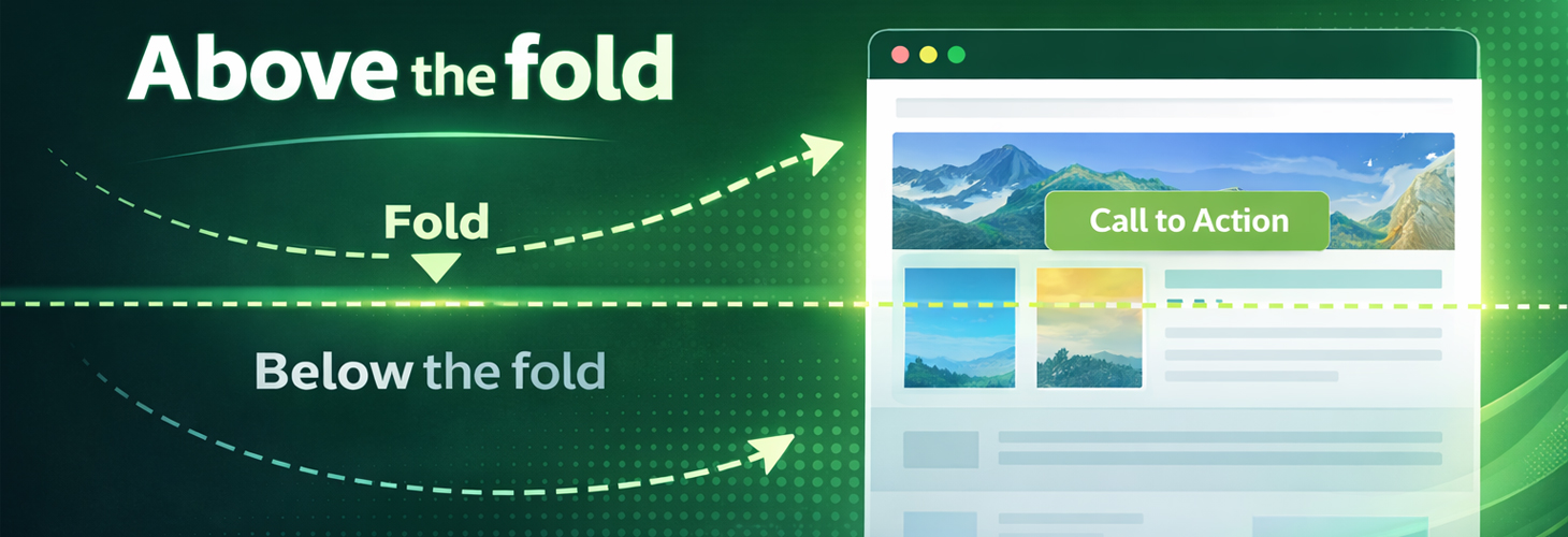
The change in user behaviour brought about by browsing on smartphones and tablets is also forcing web designers, website owners and SEOs to rethink. In this context, the area “above the fold” is particularly relevant for web design. What does this mean for the design of a page? And why does it matter so much to visitors?
Origins in print media
The term “above the fold” originally comes from printing and refers to the fold line – the line created when a newspaper is folded. In web design, it describes the area of a web page that is visible to the user after loading, without having to scroll.
Areas of a page that typically belong here:
Header and brand logo
Top primary navigation
Layout structure
Body declaration in CSS
Navigation menus
The H1 heading
Article preview
Each of these areas in an HTML document has CSS rules that matter for how the page loads. They determine how the HTML elements look. Critical CSS can reduce the loading time of these areas. Fast loading times – today measured mainly by Core Web Vitals such as Largest Contentful Paint – are ranking factors for Google. Something to keep in mind with every design.
Overloaded web pages – a common problem
Because internet users – at least in the past – were rather reluctant to scroll, many website owners tried to show the most important information above the fold. In theory, this was certainly a good approach: give visitors the information they need straight away and set an anchor point for further content. The opposite, below the fold, refers to the content beneath this digital fold line, which can only be reached by scrolling.
In practice, however, pages looked very cluttered above the fold. Visitors were flooded with information. It was just as intrusive and unattractive when advertising banners were placed above the fold instead of content. At times, online advertising was downright aggressive.
Today, internet users are used to scrolling to find additional content. Given the narrow displays of smartphones and tablets, they have to do so anyway to reach the information they want. The area above the fold therefore no longer needs to be crammed full – and should not be overdone. On the contrary: a huge amount of information, notices and ad banners in a single area of the website can actually put users off, because our brains prefer clearly structured information. That is no longer in line with effective SEO either. Web design needs to rethink its approach here.
Above-the-fold design – how does this area affect SEO?
Google has been paying more attention to the area above the fold since 2012. In January 2012, it rolled out the Page Layout Algorithm update, which evaluates the ratio of content to ads in the immediately visible area of a web page. Matt Cutts, then head of Google's webspam team, said about the change: “Sites that don't have much content ‘above the fold’ can be affected by this change. If you click on a website and the part of the website you see first either doesn't have a lot of visible content above the fold or dedicates a large fraction of the site's initial screen real estate to ads, that's not a very good user experience. Such sites may not rank as highly going forward.”
Because usability plays an important role for Google, content above the fold is part of search engine optimisation. What matters is a search-engine-friendly web design – which, in line with Google's guidelines, means placing advertising and content intelligently and not overwhelming the user.
What does the ideal solution look like – for users and for SEO?
While Google, the benchmark for SEO, values a clearly structured top section, this is exactly the part of the page that attracts most of users' attention. So how do you strike a good balance between search engine optimisation, usability and the placement of information? A good website – not only from an SEO perspective – uses the area above the fold cleverly. The motto: don't cram it full, and at the same time encourage visitors to keep scrolling.
How above the fold and below the fold work together
In general, both the content visible above the imaginary fold line and the content below it are very important for online marketing and SEO. Above the fold, the design should make visitors want more. It needs a specific hook that catches the visitor's attention and encourages them to scroll. A good way to do this is to state the USP in the visible part of the website and make clear what the page is about. Staggered columns and tables can then create incentives to scroll – for example, a text that is deliberately cut off by the fold line. When designing a pillar page, a sidebar can be the element that sparks interest. The content below the fold then has the job of keeping visitors on the page and increasing dwell time. High-quality web content can also help increase the click-through rate and lead users on to subpages.
Important for above-the-fold design
Every web design has to take formatting into account. A website and its elements are displayed differently on displays of different sizes. As a result, the fold appears at different positions on a page. Screen resolution and zoom level, for example, are decisive for the design – they vary from user to user and must therefore be taken into account.
And what about the call to action?
Whether a CTA should be placed above the fold is a matter of debate among online marketing specialists. It depends. Potential customers who know nothing about a product yet should only be asked to act at the end, once they have been able to inform themselves fully. The situation is different, for example, for very complex B2B products, where visitors already know the subject in depth. Here it may make sense to place a call to action right at the top – for instance, to download an important white paper with in-depth information. A link to a webinar would also be an option.